
I'm obsessed with web design. When I say obsessed, I'm not just talking about the "pretty" aspects of design.
I'm talking about details that earn front page Google rankings.
I'm obsessed with valid code. Did you know that websites that have completely error free coding are ranked higher by search engines? I do. It's worth the extra effort.
I'm equally obsessed with efficient sites. I don't want anyone to have to click more than once to find the information they came looking for.
I have a special knack for finding great marketing strategies for small businesses and contractors.
Economical and effective, these strategies allow small businesses to succeed against larger, better-funded competitors.
My approach is simple:
Contact me to see how you could become the "go-to" person for well-qualified new customers.


Mace Painting is a very direct website that accomplishes 3 important goals.
The 1st goal is to answer common customer questions as directly as possible. All of the information that most people will need to pick up the phone and call is clearly stated. Nothing else is included.
The 2nd goal is to gain high Google search rankings. By staking a claim to specific services instead of claiming to do everything, this site is currently a top 3 Google listing for its keywords without any additional advertising expense.
The 3rd goal is to attract customers from a geographic area that is both profitable and nearby. Commute times in Dallas can easily eclipse 2 hours each way, so optimizing the site to attract nearby Plano customers means a minimum 20% increase in profitability.
This site achieves all three goals.
Technologies used to create this site include: valid XHTML, CSS, PHP, jQuery (animated paint sample switcher), Dreamweaver, Fireworks graphics and organic SEO optimization.
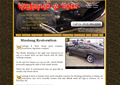
Mustangs & More is an automotive repair and restoration site that offers very specialized services alongside more typical repair shop services.
To maximize the potential reach of each service, we created a separate web page for each key service. That helps the site's search engine rankings and makes it easier for customers to find what they're looking for. A nice slideshow featuring customer's vehicles rounds out the package.
Each page is SEO optimized for the largest, feasible geographical area. People will travel farther for exclusive services like full restorations but not far at all for oil changes. Accordingly, restorations are optimized for the entire Kansas City metro while oil changes are optimized narrowly for Merriam, KS, the city in which the shop resides.
The site is currently a top 4 Google listing for its keywords without the aid of any additional advertisement.
Technologies used to create this site include: valid XHTML, CSS, PHP, jQuery (Ken Burns' style animated slideshow), Fireworks graphics and organic SEO optimization.
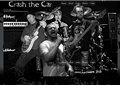
Crash the Car is a band website whose sole purpose is to entertain and engage fans.
The homepage features cutting-edge graphic design and animation code. There is also live audio, concert videos and photos taken by the fans.
The look of the site is dark and artsy-fartsy and gave me a chance to use code and techniques that would be out of place anywhere else. From the 3D band images that move with your mouse to the message-shifting background, this site has it all!
Technologies used to create this site include: valid XHTML, CSS (with CSS 3 progressive enhancement), PHP, jQuery (parallax background animation) and Fireworks graphics.
Stanton Plumbing Heating & Cooling is an independent contractor seeking qualified phone calls from new customers.
Unlike most HVAC sites, this site is very simply laid out so that customers don't have to work very hard to find information. All common questions are answered without any searching whatsoever.
To help maximize profits, the target geographical area was limited to the Kansas City Northland. That minimizes windshield time and increases the number of calls possible in one day.
The site debuted as a top 6 Google listing for its keywords in an incredibly competitive market without the aid of any additional advertisement. This should only improve as the site remains online.
Technologies used to create this site include: valid XHTML, CSS (with CSS 3 progressive enhancement), PHP, Fireworks graphics and organic SEO optimization.
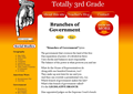
Totally 3rd Grade is an enormous educational website designed to sell educational music downloads.
What's different about this site is the strategy employed to do it.
Rather than sell songs by promoting the band (the traditional model), these songs are sold as educational resource bundles, which include a song plus a variety of related teaching resources.
This options-oriented presentation makes it very fast and convenient for teachers to shift gears easily when making lesson plans.
So far, most songs have achieved a top 3 Google listing for their keywords with a full 25% holding the #1 spot! This decentralized, give-the-public-only-what-they're-looking-for strategy is the wave of the future.
Technologies used to create this site include: valid XHTML, CSS (with CSS 3 progressive enhancement), PHP, Wordpress CMS, jQuery and Fireworks graphics.
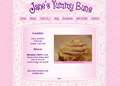
Jane's Yummy Buns is a walk-in restaurant site that is trying to become a mail order cinnamon roll business.
That meant we needed to make it easy for people who already know about Jane to find her, recommend her to their friends and to invite them back to the restaurant while also attracting mail-order cinnamon roll business, Jane's true long-term business goal.
Helping her walk-in business isn't as easy as it sounds since her location is not obvious. Imagine explaining to someone that the place they need to go is a small restaurant in the back of an antique mall, which is located in the back of a shopping center that is nearly identical to a different shopping center across the street from it.
One other detail...she's only open about 3 hours on Sundays!
Despite the hurdles, I think we ended up with a pretty nice look and feel. The site does a nice job giving directions to the restaurant while also doing an outstanding job representing the mail-order business.
Jane's Yummy Buns is currently a top 3 Google listing for its keywords (mail order cinnamon rolls).
Technologies used to create this site include: valid XHTML, CSS (with CSS 3 progressive enhancement), PHP, Wordpress CMS, jQuery (slideshow) and Fireworks graphics.
Not if you pick me.
I can take you from no previous web experience to owning a site that is:
You’ll get rock star performance without doing the grunt work yourself.
Contact me now if you're ready to take a chance on the Internet.
Ill interview you to learn as much as possible about your business and its goals.
Then I’ll research and create a concept design that follows this simple plan:
I will order your URL (every web site needs a registered web address).
I will set up your hosting (every website has to be hosted somewhere).
I will hand code the site
Im an experienced copyright editor with a BA in English and will:
Contact me now if you're ready to take a chance on the Internet.
Sites start at $450 (includes reasonable annual renewal fees)